This line of cosmetics developed by a French laboratory provides an effective and safe response to the specific problems of black and mixed skin. The target are the inhabitants of Africa, Asia, North America, Europe, between 20 and 50 years (women and men). The focal point of the brand image are people and their natural beauty. Sex is not specified, no reference to femininity. There is also no reference to the ethnicity. What matters is a human and how cosmetics affec one's well-being. The key words are: authenticity, elegance, modernity, purity, naturalness, freshness.
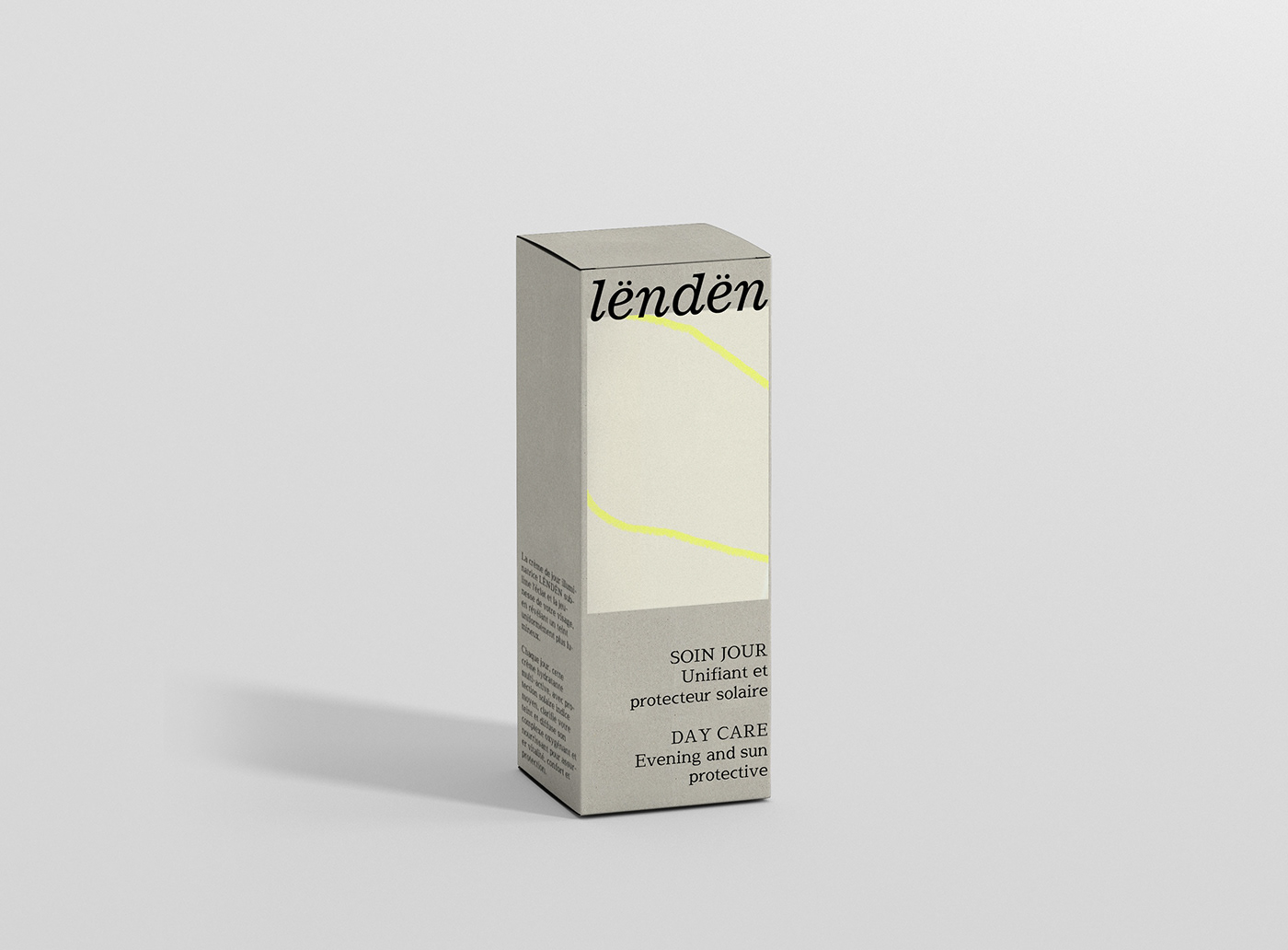
Product packaging is like human skin. Good quality of material and texture are important because they reflect well-groomed skin. The raw cardboard symbolizes bare skin. Delicate pastel printed rectangles (slightly smoother texture) symbolize the cosmetic contained or more precisely: the skin after its application. The irregular line reflects fingerprints, the natural forms found on human skin and unique to each person - just like a different form for each cosmetic. The contrasting yellow symbolizes freshness, youth, radiance and stimulation of the skin.